Pux.Reference.Contact.ImgAlt
Want a similar project? Contact Jiří.

A PLUS: A visually unique and fast website for leading Czech architects

Presentation Websites Creatives

A PLUS a.s. is one of the prominent Czech architectural firms and has been engaged in architectural studies, design, and development for over thirty years. It is behind several notable buildings in the Czech Republic, which is underscored by the fact that it has already received eight Building of the Year awards for its work.

The new website was not just supposed to be more attractive or easier to manage. We needed to come up with a new and compelling creative concept, top-notch aesthetics, and a presentation that can confidently showcase the company and its work.

Delivered Services
Presentation Websites
Creatives

Initial State

  • Static presentation without significant movement.
  • Aesthetics that no longer matched the company's position in the industry.
  • Lack of emotion and storytelling in the presentation of projects.
  • Limited space for the client's recognizable architectural style.
  • Difficult content editing on the client's side.

Our Solution

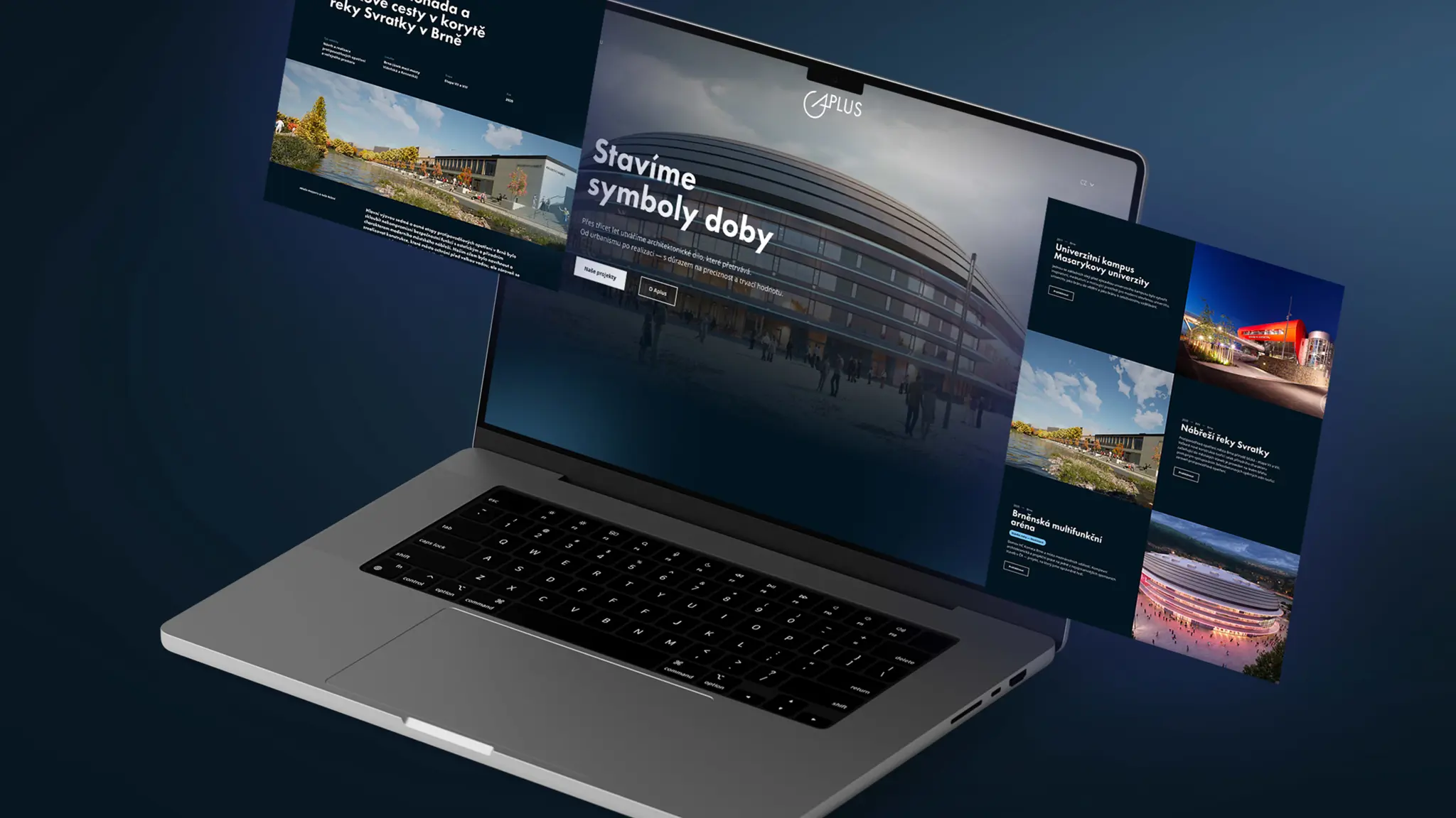
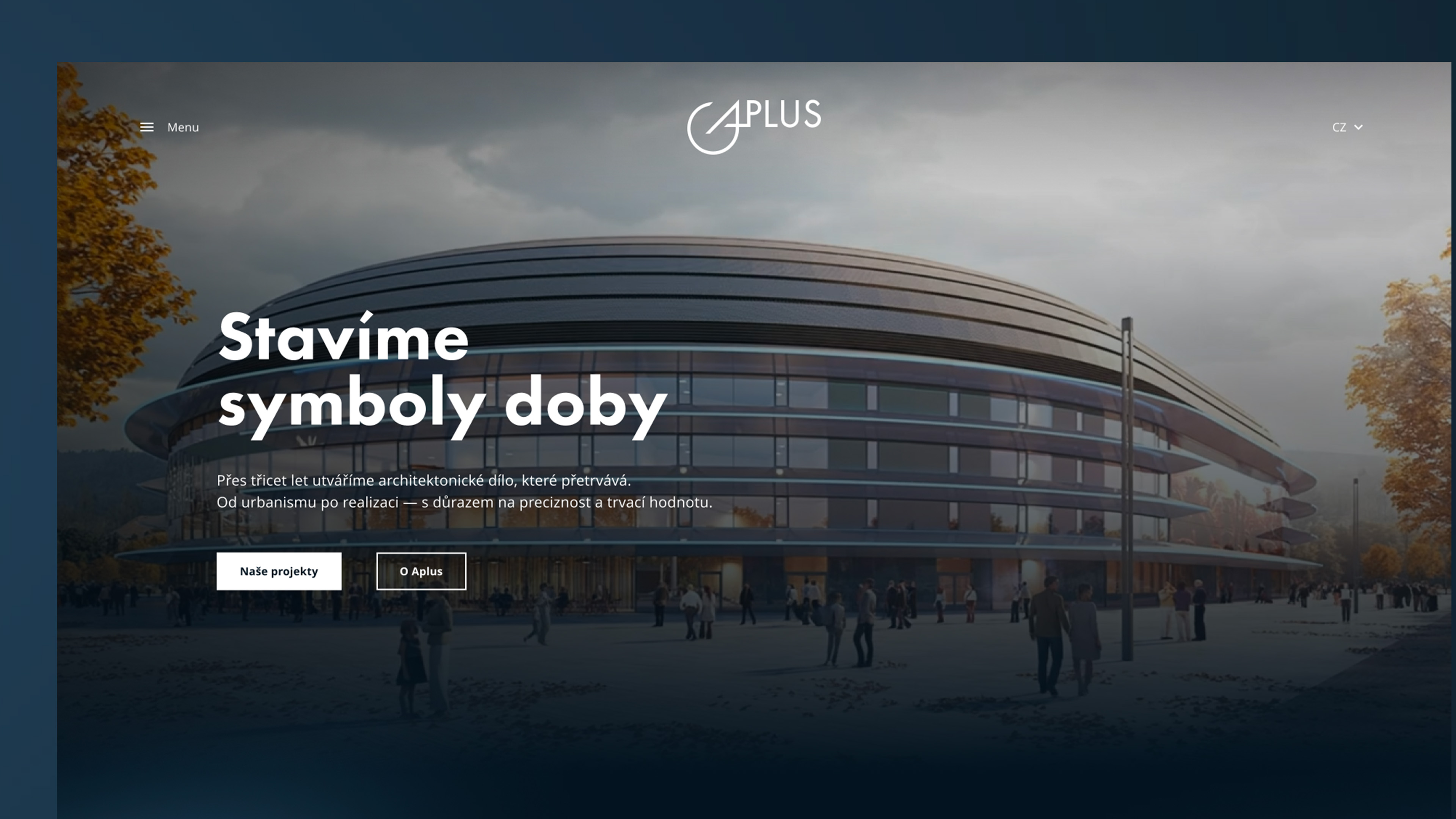
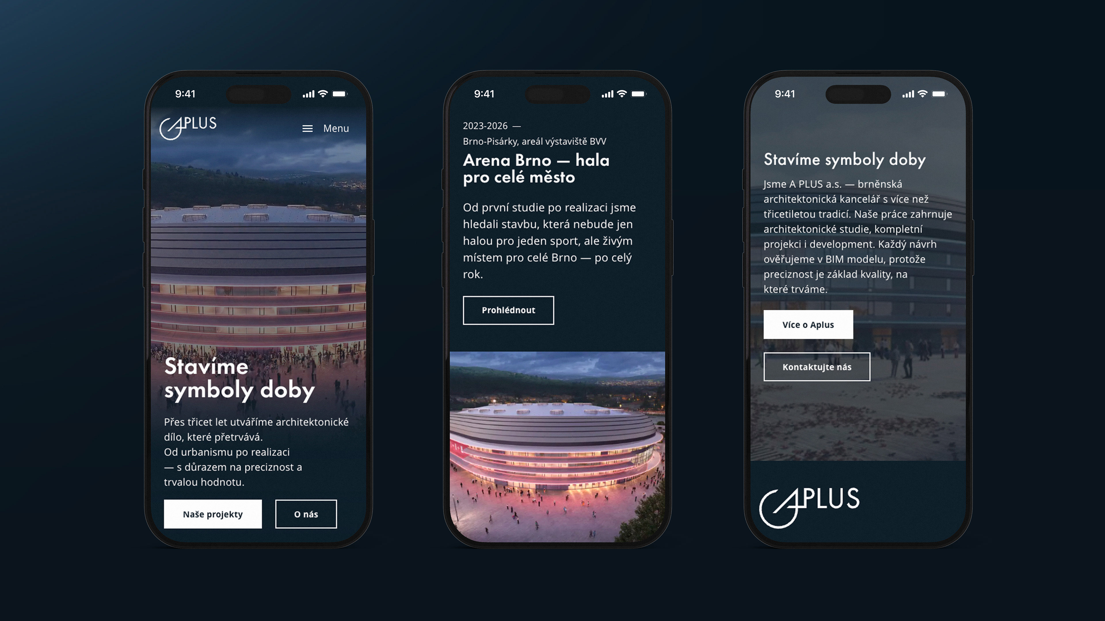
  • A unified communication concept built around the slogan "We build symbols of the times."
  • A confident tone of voice connected with typical aesthetics.
  • A clearer structure of information and refined user interface.
  • Modernized graphics and color scheme that align with the visual identity of A PLUS.
  • Dynamic elements and a gradual reveal of information.
  • A more prominent presentation of key references.
  • A more human and playful introduction of the team.
  • Simplified content management.
  • A fast website despite visually appealing elements.

It Starts in the Dark or a Well-Lit Gallery

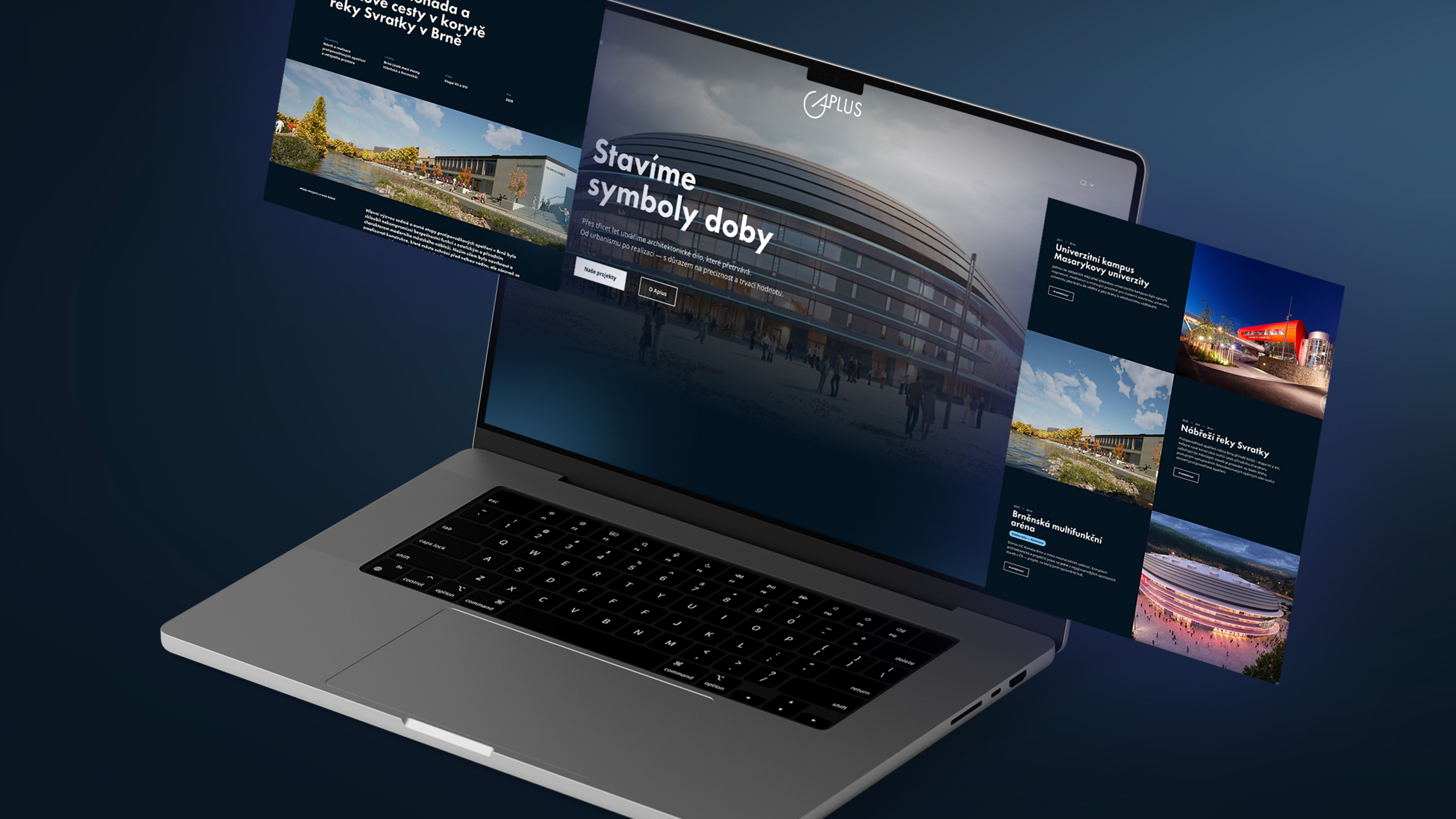
White backgrounds are used by about 80% of websites when presenting architecture. We sought a perspective that would distinguish A PLUS while allowing the projects to shine through playfulness and emotion. Therefore, we began to experiment with the contrast of light and dark, mystery, and gradual revelation. The foundation of the website became a modified dark blue color complemented by white text and light blue accents. The dark blue derives from the company's visual identity, where it serves as the primary corporate color. The strong contrast also ensures good readability and focuses attention on the presented buildings. The resulting visual resembles a dimly lit gallery that:

  • gives the exhibits a more exclusive character,
  • highlights the light, colors, and materials of the buildings,
  • focuses attention on the projects themselves,
  • creates space for working with tension and gradual revelation.

How to Present Architectural "Symbols of the Era"?

The realizations from A PLUS have a confident and recognizable style, which is the basis for the central slogan "We Build Symbols of the Era". We discovered it on a previous web presentation, buried among other texts. However, it seemed so significant that we incorporated it not only into the copy but also made it the overarching concept of the entire website.


When presenting selected projects, we work with the silhouette of the building, which serves as a symbol. The visitor, through the use of scrollytelling, scrolls down the screen and:

  1. First sees the characteristic outline, silhouette, symbol.
  2. Then the real appearance of the building is revealed.
  3. Finally, the photograph comes to life and the realization animates.

As a result, the portfolio of references does not appear as a simple list of completed projects but becomes the main carrier of the brand's story and helps the visitor perceive the uniqueness of each project.

“We wanted the A PLUS website to not feel like a catalog laid out on white paper. Therefore, we worked with silhouettes, light, and dynamic reveals of the buildings. Together with the client, we quickly agreed on the main direction, allowing us to focus our energy on the details that refined the entire concept.”
Peter Kušnírik
Design Lead
Jiří Gédoš
UX Designer
 

Video as an Essential Presentation Element

The client wanted a dynamic presentation of their work, but suitable videos were not available for most projects. Instead of settling for static photos, we animated the key frame of selected projects using generative AI. Significant references thus received a clear presentation logic starting with a silhouette and ending with a realistic animation. Movement here does not serve as a mere effect. It helps the visitor navigate from the first hint to the complete revival of the structure.
 

The new presentation thus:

  • gives key projects more space,
  • communicates their architectural quality more clearly,
  • supports brand memorability,
  • distinguishes the website from standard static portfolios.
Additionally, we repurposed the animated visuals of projects such as Arena Brno, the Svratka River waterfront, Masaryk University campus, or the Holubice Technology Center to revitalize the homepage.
 

"We needed a confident and dynamic presentation of our work that would match the quality of A PLUS's implementations and clearly distinguish us. We had high demands for the final aesthetic level. The collaboration with PUXdesign was efficient, and we quickly found a direction that managed to combine architecture, content, and movement into one whole."

Patrik Tuza
Předseda představenstva
A PLUS a.s.

Work in a team that doesn't go far for a smile

The new website was not only meant to showcase buildings. One of its goals was also to attract experienced professionals who would like to collaborate with A PLUS. Therefore, we added a simple yet memorable element of humanity: a smile.

Each team member is initially introduced with a serious expression in their photograph. When a visitor hovers over it, the portrait transitions to a second image where the same person is smiling. This small interaction brought several practical benefits to the company's presentation:

  • it shows the specific people behind significant buildings,
  • it softens the formal nature of the corporate presentation,
  • it promotes a friendlier image of the company,
  • it helps potential candidates get to know the team better,
  • while maintaining the professional character of the brand.

Website as fast as lightning regardless of complexity

Even a demanding and elaborate presentation does not affect the speed of a website running on the core PUX Olive. Although the solution works with dynamic animation, layering of images, and video, it has been fine-tuned to maintain very good speed. This is confirmed by the results in PageSpeed Insights tests:

  • 99% on desktop
  • 93% on mobile devices
The technological foundation is the Orchard Core platform with the aforementioned PUX Olive extension. For the client, this solution means:
  • fast website loading,
  • a modular base for further development,
  • more flexible content management,
  • a unified structure for adding additional projects,
  • the ability to develop the presentation without returning to the difficult editing of the original website.
The result combines something that often opposes each other on the web: a strong visual experience and quick response. Therefore, nothing unnecessarily distracts the visitor from what is most important, namely discovering the content of the page.

Do you have a strong brand? Give it an equally strong website!

We create presentation websites that do not look like just another template in line. We connect content, design, and technology so that your brand stands out and visitors quickly understand its value.
 

Let’s find a concept together that will work just for you. Contact us.